Monday 29 August 2011

Late Summer in Town and Country

A good couple of weeks.  A visit with my guide, "Master of the Marsh",  Bob,  to Oshawa's Second Marsh.  Unfortunately this was more of an encounter with vicious mosquitoes and sex-mad Midges than a photo trip.  Also it was back on my bike again around Courtice to catch up on changes.
A sunrise visit to the Cherry Beach area of Toronto with Randy and John started with some rain but it cleared and there was still some good light.  As a first-time visitor, the Cherry Street area was full of surprises for me.  Cherry Street Bridge from the 1930's is a "pont a bascule" - a see-saw, lift design with two giant 750 ton counterbalance weights. How would it have looked new? Possibly this postcard recreation would be close:


Some other views:  
In the best possible world, the "Danger Sign" would not be there to distract our eyes - so I took it off!  The splash of red bumper is much better.

This is a bridge with great angles

and lots of photogenic rust

The Cherry St. Beach area is also full of other surprises:

From pleasure boats?:


to mountains of salt :
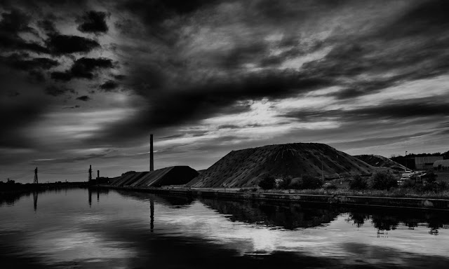
Salt mounds view from the Cherry St. Bridge.


Back to the country

At the Second Marsh signs that fall is coming are clear but still lots of summer colour to enjoy: 


Highbush Cranberry
Not much left to eat on this one:

Don't know what these are but "Madonna Mushrooms" works for me:


From 'extensive' google research these are most likely swarming Midges (Diptera Chironomidea) in their last life cycle stage - intensive mating:


And, an indefatigable Cormorant enjoying the early morning.


Then Bob wandered off and I haven't seen him since -maybe he is doing a blog?:


Courtice  is getting ready for the fall as farmers re-vitalize their fields:


The evening light is great, here catching the blowing Silver Lindon trees


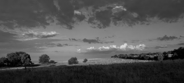
And best of all, cooler weather and strong clouds are creating lovely bright, contrasty light to bring out the best in the landscape:


Friday 19 August 2011

"Too Many Notes, Mozart"

A Self Critique - "Too Many Pixels, Brian" and musings about HDR.


This week I'm thinking about the  famous complaint of Emperor Joseph II about The Marriage of Figaro - "too many notes, Mozart".

Looking at an image I made last week at one of my favourite locations- the barn on Enfield road, I found myself thinking about the emperor.  What he was saying could easily apply to one of my images this past week - perhaps too many pixels, too overstuffed.


A colourful sunrise, eye-catching colours in the foreground, barns, an interesting composition, lots of mood -I thought this a good effort all round.  Then, the image was not working at all.    It looked underexposed and simply overloaded with colour and overstuffed with too many different "actors" ( I learned this term at the Oshawa Camera club.)  Was each actor in the image competing for attention and just creating a confusion?  There are a lot; rich colours, barns, the tree, the yellow-green vegetation, dark clouds, green field, and that all too broad area of light-brown.  

Simplifying, by taking away the element of colour definitely creates a different dynamic. But has it lost its early morning mood?  Can even the tree be cropped out now as the colourful sky around it is no longer in play?


  No Tree works too:


 But what happened to my "early-morning-mood"?  Better composition, sure, but no glorious colour, and is the subject now just the barn?  Really, the early morning is all about enjoying the light and the colour -why else get up at 5 am!!  Just up the road, behind the barn, I took this one. I like this better:


 As proof, the B&W version,  because there are so few actors and no colour its impact seems very flat:


 Some other examples from the last two weeks:  Seems there are no hard or fast rules here other than the old lesson...for impact keep it simple.


And a re-visit to Oshawa's Second Marsh:


Trying out Nik's infra red filter


HDR Angst

To help reproduce what my "eye saw" many of the images above have had some HDR (High Dynamic Range) and Nik filter post-processing but I hope its not too obvious. However, these below are clearly grungy HDR.   I'm a big fan of what HDR can do but does this type of HDR take us out of the realm of photography and into what I call "illustration art", and if so, does it really matter?  I can't decide which placement of the hut is better - the first or second image? 

Tobacco kiln, Newcastle.


Visually this next image is very appealing ...  Artistically B&W is an abstraction from 'real' experience so why not this?


Sunday 7 August 2011

Sunrise Worship Cult

The Sunrise Worship cult drafted a new member this past couple of weeks, mainly "yours truly." John, Randy, and I met recently at Lake Ontario's shore south at Courtice, (go south from the 401 on Courtice Road)  where there is easy access and some parking.

Sunrise Worship Cult

  Conditions were quite comfortable and the light and cloud put on quite a lovely show.


At first, quite tricky long exposures were required.  I like the softening of the water this creates but at the same its hard to keep distant features in sharp focus because the lens is stopped down considerably giving time for vibration of the lens which adds blur where you don't want it - on the tree for example.  But later, as the light got stronger it was possible to expose for better effect.


And it always pays to turn around from the direction of the sunrise (sunset too) and see the impact the light is having behind you:


Finding a foreground element is often tough on the shoreline, but sometimes they are right in front of you!


Once again,  using some plugins for B&W and sfx adds a little creative fun:


Heading back up Courtice Road,  the light was good  but changing this image to B&W shows the impact of the light better perhaps.


A few days later, and another sunrise, the early light  as expected was just perfect for these derelict tobacco-drying huts north of Bowmanville.